Westmont Magazine Speaking Through Illustration

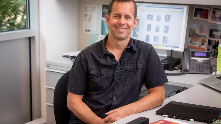
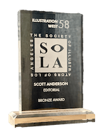
Art professor Scott Anderson has earned yet another honor for his illustrations, this time a Bronze Award from the Society of Illustrators Los Angeles for a cover he created for the Miami New Times. The 2020 American Illustration annual, the most prestigious illustration industry competition, has also accepted the cover. Ellie Haldors, senior brand designer at Westmont who creates the layout and look of the Westmont magazine, interviewed Scott about his artwork.
Can you tell me more about the award and the Society of Illustrators Los Angeles?
This award comes from one of about five different illustration competitions well known among illustrators. Thousands of applicants submit entries, and it takes a majority vote of a panel of peer judges for work to get chosen. The categories for awards include editorial, book, advertising and institutional.
My illustration for the Miami New Times won the Bronze Medal in the editorial category. This meant a lot to me because it focused on the Homestead juvenile detention center, a controversial issue close to my heart. The Miami New Times approached me and gave me free reign to design something that would represent this issue well. Most editorial staff come with a preconceived idea of the illustration they want. The Miami New Times trusted I could make a compelling—and smart—picture.
I felt deep anger about this issue. The cover story describes the conditions in a detention center in Homestead, Florida, for migrant children separated from their parents. Public outrage caused the government to shut down the facility after it grew rapidly—from 1,350 to nearly 3,000 beds—in a matter of months. The government claimed children remained there only 36 hours, but actually held them for many months.
As I painted the chain-linked fence, I poured my anger out into the illustration. It was a cathartic experience for me. Elizabeth Warren later protested outside the center, bringing national attention to it. Knowing that I added a few drops to the tidal wave of American sentiment against the facility made this illustration the single most meaningful one I’ve ever done. The icing on the cake was getting the Bronze Medal for it.
What kinds of illustrations do you most often get commissions for?
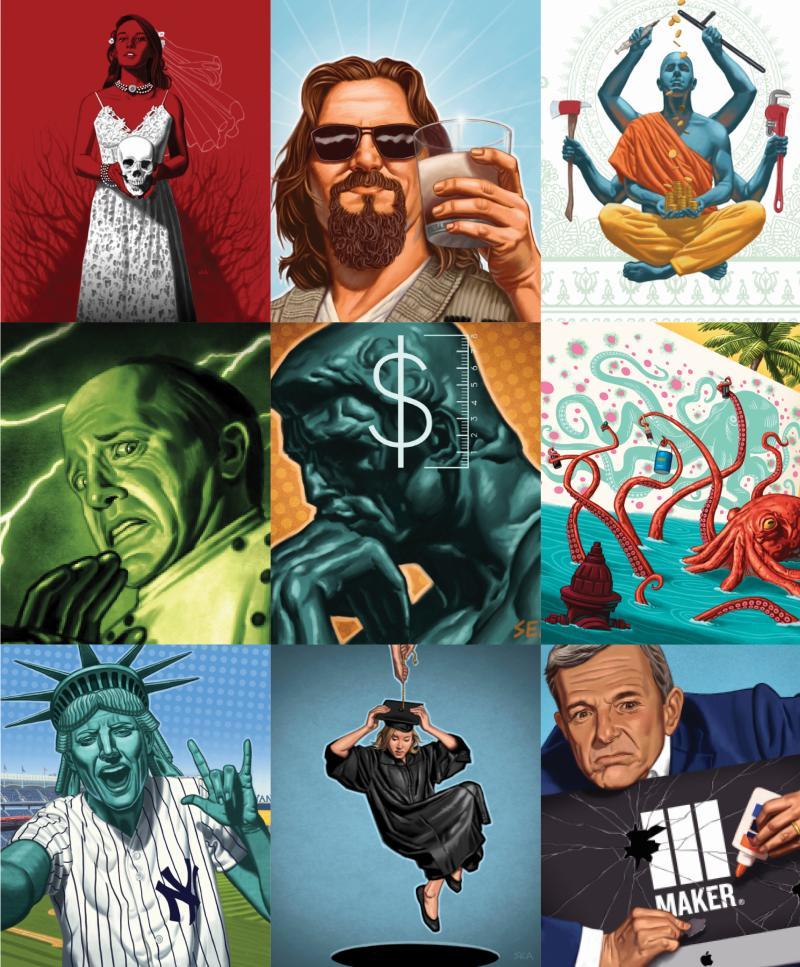
Almost all my commissions are editorial illustrations for magazines or newspapers, and some fall in the category of social and political issues.
How important is it for your own beliefs to align with the opinion you’re illustrating?
It depends on the piece, because some illustrations are about completely benign topics, and even then, painting a particular concept doesn’t necessarily mean any kind of endorsement. But when it comes to matters of politics or faith, then it’s crucial that my personal beliefs line up with the message of the piece; the Miami New Times cover is a great example of this. I have turned down assignments before that would have compromised me personally, and I encourage my students to view their own future work through a similar lens.
Can you tell me a bit about your illustration process?
I generally take numerous photos and paint from them. My work is realist-based, so I do best when I’m working from reference. In the past I have used fellow Westmont professors and even on occasion my students as models.
How do your teaching and your students inspire your freelance work?
It’s probably the other way around––my freelance work influences my teaching. If a teacher isn’t illustrating at least some of the time on a professional level, why teach illustration? In some fields, professors can teach without being practitioners because they’ve chosen to teach instead. But if you’re teaching painting, I feel that one should be active in your own painting career. I also really love illustrating—and I love seeing my work in print. Every time I do a cover, even for a local newspaper like Miami New Times, about 100,000 people see it. That’s one advantage of working in print media: You can communicate on a large scale.
How has your work evolved over the years, and how has changing technology affected your work?
First, like many artists, I have a tendency toward self-loathing of my work, so I’m constantly seeing only the flaws. We artists are our own worst critics. One of my mentors told me I’d be in my 40s before I started liking my own work, and that’s true. I’m 46 now and I’m only now starting to appreciate my own art.
Second, technology has certainly changed. At 20, I wouldn’t have believed how I’m able to work today. I started doing digital illustrations drawing on a tablet connected to a monitor, and you have to get over that disconnect of not drawing where you’re looking. But when the Cintiq came out about 2012, it changed everything. With this new technology, I can draw right on the monitor. That jump was amazing, I couldn’t stop smiling. The next step was painting on an iPad Pro, which is how I’ve done most of my recent client work. I can sit on a couch instead of being huddled in my studio over my Cintiq screen. I can work on illustrations very easily and portably during down time with the iPad Pro.
The more paintings you do, the better an artist you become. For a long time, I couldn’t see my own style. Some friends pointed out to me that people can recognize my work and I now have a distinct style.
Can you tell me about the new design program at Westmont?
Yes! It will be a concentration in graphic arts. Westmont already has an all-Cintiq graphics lab, unheard of for a school our size. We are adding a couple of courses to fill out the new concentration, specifically in Typography and Design for Web and Screen. The program will serve students interested in graphic design as well as illustration, and some may create hybrid programs of graphic design and communication studies or business. Students can take one or two communication studies classes as electives, as well as a class in marketing strategies. The concentration resembles our studio arts major, with a few changes to some required courses. At Westmont, we can provide rigorous preparation for a career while also training creative, conceptual thinkers.
A Quick Sketch of Anderson’s Stunning ShowcaseCareerHe became an adjunct instructor at Westmont in 1999 teaching Computer Graphics I and II while also teaching at Santa Barbara City College and freelancing as a graphic designer/illustrator. He moved to a full-time Westmont position in 2002, was appointed to a tenure-track job in 2006, received tenure and later earned promotion to full professor. Beginning in 2010, he focused his freelance practice primarily on illustration. He mainly illustrates for the editorial market, including magazines and newspapers. He has created several kid-lit book covers for Penguin Random House. He exhibits occasional gallery work in group shows with Sullivan Goss in Santa Barbara. AwardsHe has won multiple first-prize awards in publication design from the American Association of Museums. He received the Westmont Faculty Research award in 2017 for his illustration work. Numerous illustration competitions have accepted his work. Communication Arts American Illustration Society of Illustrators New York Society of Illustrators of Los Angeles
ProcessHe has trained as a traditional draftsman and painter and still does traditionally based work. He paints most of his illustration work digitally, either using Photoshop and a Wacom Cintiq or his iPad Pro using the app Procreate. Graphic Design CurriculumWith his specialization in digital illustration, the college evolved its Computer Graphics II course into Digital Painting. Westmont is one of the only liberal arts colleges in the country to offer this class and to have a fully equipped Cintiq graphics lab, which allows students to draw and paint digitally on professional-level equipment. |
View Anderson's portfolio on his website, scottandersonstudio.com |


